Emerging Web Design Trends for 2025: A Guide to Future-Proof Your Website
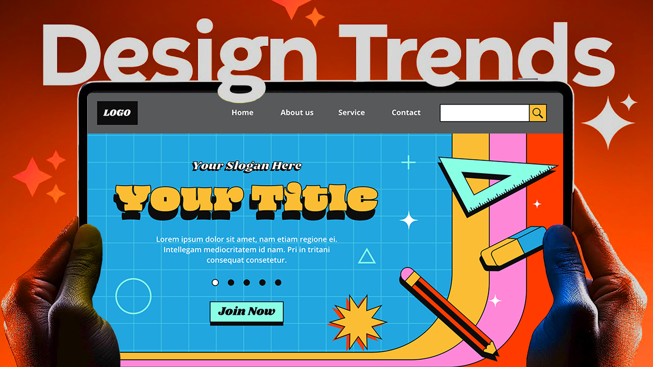
Web design is always changing. New ideas and tools come out fast. To keep your website fresh, you need to stay on top of the latest trends. In 2025, some styles will be popular, while others will fade away. This guide shows the most important trends to watch and how you can use them today.
Web Design Trends Set to Shape 2025
Anti-Design: Breaking Rules for Unique Style
Anti-design is about doing the opposite of what’s normal. Instead of neat grids and perfect layouts, it explores chaos and surprises. It’s perfect for posters or bold brand sites that want to stand out. With no-code tools, you can now create wild designs easily. Imagine adding motion to a static image or making a background so large it feels immersive. These bold looks weren’t possible before without tough coding. But today, tools let you experiment freely. Just remember, overdoing anti-design can look confusing. Use it when you want an edgy, artsy vibe, but keep it balanced to avoid overwhelming visitors.
Experimental Navigation: Rethinking How Users Move Through Your Site
People are tired of regular menus at the top. Instead, designers are trying new ways to help visitors explore. For example, Skyvia uses a zoom effect where the whole page feels like a giant canvas. You zoom in to see details or move left and right to browse. It’s almost like walking through an art gallery. Another great example is Canal Street Market, where pages unfold like paper and stay connected. You don’t feel like you’re leaving the site. To try this, use panning, zooming, or unfolding animations. Focus on making navigation fun and easy so users want to stay longer.
Scroll-Driven Design and Macros Animations
As you scroll, websites are doing more than just moving images up and down. They add layers of 3D, text flying in, or images sliding in sideways. It makes browsing feel more interactive. A new trend is macro animations — big reactions to your mouse or scroll movement. For example, the Big Picture Company uses 3D letters that fly out or spin as you move. Some sites keep it subtle, with slight movements, while others go all out. The key is balancing engaging elements without tiring your visitors.
AI-Integrated Chatbots
With AI booming, many websites add chatbots that can converse with visitors. These bots aren’t just small pop-up boxes anymore — they’re integrated into the whole site. Some are floating bars that respond to prompts, others look like smart assistants. They can give personalized suggestions or help with questions. Every site will get its own twist on AI, making each experience unique. To succeed, focus on designing simple, helpful AI conversations that improve user experience.
Smart Videos for Better Content
Videos are replacing regular images on many pages. A quick 10-second clip of a product in action, instead of a static picture, grabs attention and explains quickly. Some videos only load when you hover or scroll into view. Hulie does a great job showing small, subtle videos that match the content naturally. Use videos sparingly and keep them relevant — slow videos that don’t distract will boost your site’s appeal.
Cursor Animations: Bringing the Mouse to Life
Gone are the days of plain, arrow cursors. Now, cursors animate to interact with the site. Imagine a paintbrush effect that makes it look like you’re creating art as you move. Or having different tools that move as you drag the cursor. For example, Stripe’s site has draggable windows and checklists that feel like controlling a mini computer. Use cursor animations to add personality, but don’t overdo it. Keep it subtle to make your site engaging rather than overwhelming.
Core Aesthetic and Design Elements in 2025
Custom Illustrations: Adding a Human Touch
Unique drawings can give your site warmth and personality. Instead of stock photos, hand-drawn art feels more personal. London Therapy’s site uses illustrations that look friendly and inviting. You can combine simple animations with illustrations for a lively feel. Custom art helps customers connect with your brand more deeply, especially if the style matches your message.
Full-Screen Headers and Hero Sections
Big, bold first impressions still matter. Full-page headers stay visible while visitors scroll, creating a feeling of immersion. Some sites use videos in the background to spark curiosity. Off Menu’s site keeps you engaged on one large screen, then lets you click to view case studies without leaving the main page. Make sure your hero sections are colorful, clear, and powerful to grab attention immediately.
Bento Grids: Organized and Visual Layouts
Bento grid layouts arrange bits of information into a mosaic. This style is easy to create with CSS grids and no-code tools. Walmart’s homepage uses organized square blocks for easy browsing. You can also mix images, text, and animations within each grid tile. Use grids to keep content tidy and adaptable for mobile devices as well.
Expressive Fonts and Unique Typography
Fonts are more than just words — they tell a story. Bold, outlined, or animated fonts add character. For example, some brands use big capital letters with strokes or emojis to make a fun, energetic vibe. Choose fonts that match your message and don’t sacrifice readability. When done right, expressive typography makes your site unforgettable.
Color Trends and Palette Choices
Colors influence feelings. Mocha, an earthy, warm brown, is this year’s Pantone color. Bright, vibrant colors combined with muted tones draw attention to call-to-actions or key messages. Sites are not afraid to jump into full color or mix palette styles for a lively effect. Test your colors across screens, thinking about contrast and mood.
Trends to Leave Behind
The Overwhelm of Brutalism
Brutalism relies on loud, oversized elements that clash in a chaotic way. While young designers love it, many users find it chaotic and hard to read. Use brutalism sparingly if at all, stopping from creating visuals that might scare visitors away.
Overdone Minimalism
Sometimes, less becomes too little. Overly sparse websites can come off as cold or unfinished. The goal isn’t to strip everything down but to balance negative space with clear content. Make sure visitors can find what they need without feeling lost or bored.
Excessive Micro Interactions
Small animations and hover effects are great, but too many can distract or slow down your site. Use micro interactions thoughtfully — a subtle glow can emphasize a button, but don’t turn every element into a shiny object.
Practical Tips for Creating a 2025 Website
Always prioritize the user’s experience and accessibility.
Mix and match new trends carefully, avoiding clutter.
Use no-code tools and AI to try new ideas fast.
Keep your brand’s voice clear and consistent.
Fine-tune your site based on feedback and trends.
Conclusion
2025 is shaping up to be a great year for web design. Trends like anti-design, experimental navigation, and macro animations push boundaries, creating dynamic and memorable experiences. At the same time, elements like custom illustrations and bold typography help your site stand out. Keep a healthy balance between new styles and user-friendliness. Experiment with these ideas to craft websites that not only look great but also work well. Stay curious, stay creative, and your website will be ready for the future.